Monster and Fairy Tale

It is time to put your Photoshop skills to the test. You will be transforming yourself into a Monster or Fairy tale creature.

Requirements

Part 1

  • Develop eight sketches, 4 up on a page, of yourself being transformed into a monster or fairy tale creature. You will have to develop the background to place yourself (headshot) in an environment. The sketches should have color in them as well.
  • Size: 4” x 5”, resolution 300, color mode RGB.
  • Once all your sketches are done, 4 will be chosen for you to develop on the computer.
  • Once all four creatures are done put them in one document like we did for your Andy Warhol self-portrait.

Part 2

  • One of your creatures will be chosen from your final four.
  • You develop two to three full-page sketches showcasing yourself (more than just a headshot) and placed in a photorealistic environment.
  • Size: 16” x 10” (landscape), resolution 300, color mode RGB
  • You must also develop two other creatures to go along with you in the environment.

Photographic Alphabet

This image has an empty alt attribute; its file name is 7.jpg
This image has an empty alt attribute; its file name is h.jpg
This image has an empty alt attribute; its file name is o3.jpg

What interesting and unique alphabet can you capture using your eye and your camera?  This project asks you to observe your environment in search of objects which can be seen or interpreted as letterforms.

requirements

– you must photograph the entire alphabet from A-Z and numbers 0-9.  This can be done in all caps, all lowercase or a mixture of both.

– photos must be either all vertical or horizontal.

– NO handrawn/created letters or photos of other types of printed lettering, i.e. signs, billboards, banners, etc.

– your performance will be judged on creativity, originality, and quality of photographs.

– once you have taken all the pictures, renumber the files.  01 should be A, 02 B,  and so on, 35 will #9 and 36 #0.  You will set up the in Photoshop using provided instructions:

OUTPUT (two options)

In Bridge, click OUTPUT in the upper right-hand corner.  Choose the folder which contains your renumbered photographs.  The final size will be 11” x 16”, or vise versa, depending on vertical or horizontal photos.  Resolution 300, RGB color.   Rows and columns 6 x 6.  Manually rotate, move, crop photos as needed In photoshop type out your name at the bottom in 12 point type.

– save your file as a PDF at the bottom of the page. Open up your PDF file and change the paper size to Tabloid, if you do not see this click on the “details” button. This should expand the window with more set to show the page size settings.

OR

In Photoshop, at the top under FILE: click on Automate: click on Contact Sheet. Choose the folder which contains your renumbered photographs.  The final size will be 11” x 16”, or vise versa, depending on vertical or horizontal photos.  Resolution 300, RGB color.   Rows and columns 6 x 6.  Manually rotate, move, crop photos as needed In photoshop type out your name at the bottom in 12 point type.

Color Terms

Terms:

Value – 1. The relative lightness or darkness of color in a picture. 2. That aspect of color by which a sample appears to reflect more or less of the incident color. 3. Lightness or darkness; the amount of white or black.

Saturation – refers to the dominance of hue in the color.

Collage – An artistic composition of materials and objects pasted over a surface, often with unifying lines and color.

Dominance – Preeminence in position or prevalence; ascendancy. 2. The tendency for one element or group to command greater attention than another

Simultaneous contrast – Two colors, side by side, interact with one another and change our perception accordingly. Simultaneous contrast is most intense when the two colors are complementary colors.

simultaneous-contrast_anima

Complimentary color – On a standard color wheel they are the colors opposite each other (red/green, yellow/blue). They look good together and compliment each other.

cool vs. warm – Warm colors are based on yellows, oranges, browns, yellowish greens, orangish reds, and the like. Cool colors are based on blues, greens, pinks, purples, blue-greens, magentas, and blue-based reds.

Monochromatic – a color scheme based on variations in a single hue. For example, a light, pastel blue, a medium navy blue and a dark blue-blue may be used in a room interior.

Analogous color – a color scheme based on hues that are adjacent on a color wheel, such as red, red-orange, and orange.

Color Grid

Project Overview

This Project asks you to create the most interesting and unique color compositions possible. The goal is to study how color is affected by pattern and context, see color relationships, and begin to work with complex grid structures. Making incremental changes can bring about large variety within a system. In this assignment, we will focus on changes of color.  There are several parts to the project so be sure to work methodically and carefully.

Terms:

-Analogous colors

-Complimentary colors

-Cool colors

-Warm colors

-Monochromatic colors

-Simultaneous contrast

Part 1

In your sketchbook design six 2″ inch squares. Follow these rules in your design.

Each square design may be diagonally, horizontally or vertically, or any combinations of such. (three elements, no more than five per square) 

Color grid01

Part II

Once you and your professor select a 2″ inch modular design from your sketches, create a linear grid structure based on the shape. This grid will serve as the pattern for all of your compositions. You may orient your pattern any way you wish. See linear grid examples. By having the same grid structure underlying all the compositions we can focus our attention on how different color schemes and choices affect the artwork.

color grid02

Select 3 to 5 colors per composition. Potentially you could use a maximum of 30 different colors to complete this assignment, though you should use the same color in more than one composition a few times to see how that same color behaves in different contexts. On occasion, colors may be placed next to themselves, thus eliminating the grid and creating what appears to be a new form.  Be careful not to go overboard and always serve the overall aesthetic value of the work.

In all you will create 6 different color compositions, one representing each of the following terms:

-Analogous colors

-Complimentary colors

-Cool colors

-Warm colors

-Monochromatic colors

-Simultaneous contrast

Iconology – Stage 05

Stage 5

5a.  Use a metaphor for a human body part (combined with analogous or contrasting body parts). 

5b.  Place in another time or culture.

5c.  A free collage reflecting the use of the icon (image/text). You must have at least 5+ elements within your design.

5d.  Add color to part of your icon.

5e.  A kinetic sequence.  This event can take place in one frame or in multiple frames.

5f. Rasterize your icon. Use the grid provided. 

• You need to develop four solutions for each stage by sketching and then picking one to develop on the computer

• Maintain the format of  5” icon on a 6” x 6” white field

Icon stage 3/4

Stage 3 and 4

stage three: visual icon influenced by something else

3a.  Transform the icon to reflect the meaning of an applied action term.  Incorporate the word form in the design.

 stage four: visual icon combined with another object

4a.  Combine the icon with a letter form that most clearly represents the symbol.

4b.  Combine with another symbol; trade with someone.

4c.  Combine with your own body part; formal relationship OR combine with your body part in a functional meaning.

4d.  Combine with a related texture to amplify meaning.

4e.  Added to; to physically alter its visual connotation.

• You need to develop four solutions for each stage by sketching and then pick one to develop on the computer

• Maintain the format of  5” icon on a 6” x 6” white field

Icon Stage 2

Now that you have developed and refined the icon for stage 1, deconstruct and transform the visual qualities of the form to make a more dynamic and thought-provoking statement.

2a.  Deconstruct the icon as related to the function/meaning of the image.

2b.  Deconstruct the icon as related to a chance operation.

2c.  Change the form, if curvilinear to a rectilinear form, or vice-versa.

2d.  Transform part of the form: distortion, scale, change, inversion, etc.

2e.  Crop the form to its maximum limit, but still, maintain its visual recognition.

2f.  Create repetition by use of ornamental pattern.  No icon should overlap the next, but organize it so it is logical and predictable.

• You need to develop four solutions for each stage and then pick one

• Maintain the format of  5” icon on a 6” x 6” white field

Iconology – stage 01

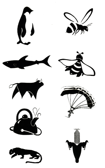
several icons

Design an icon that suggests a quality or fact, an image that symbolizes the activity that it represents.  The icon/symbol you create should be independent of time, simple and so coherent in its composition, that no part of it may be removed without diluting the message.

The primary focus should be on a strong, concise and concrete visual statement.

Stage one: the creation of the icon (1a)

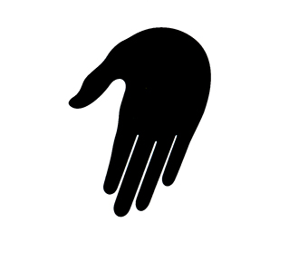
hand icon

• Choose, mostly from your memory, an object by comparing it to a symbol, cliché, and archetype (prototype).

• Sketch the first ideas without the use of a template or ruler to initially construct these thumbnails.  Make 50 multiple fast versions.

• The goal is to create the greatest possible simplification of form, unquestionable recognition that utilizes strong form/counter form relationships.

• The icon you construct should not use any stylistic elements that distract from the intended message.

• Compare the versions before focusing on just one. Make slight modifications to solidify the symbol.

• From your sketches, six icons will be developed into a 3” x 3” icon using rulers and sharpies. One will be chosen to be your final icon.

• Clean-up your final chosen icon to a finalized form using appropriate art tools.  Use a 5” x 5” format for this final stage.

• Compile a list of associative terms that relate to the object that you have chosen to utilize.  Then, develop 3 categories (verbs, adjectives, and nouns).  Fill each category with a minimum of three terms from your list.

• Place your 5” icon on a 6” x 6” white field.

– This icon that you build will become the basis for future exploration that will extend the icon’s initial focus and meaning.